How are letters and pictures laid out in the book? Can I change that?

Designing the book for printing is an iterative process that involves both a human and a computer algorithm. The algorithm lays out the letters and pictures on the printed page, following a set of rules, and the human revises and checks the quality (e.g. making sure that the layout is consistent across letters, that paragraphs stay together on a page, that a letter doesn't overflow to the next page unnecessarily, that the images are cropped and rotated as needed, etc). The process repeats itself until all issues are ironed out.
These are the rules that the algorithm follows:
- Each letter goes on its own page (extending to more pages if they are longer)
- The first page each letter has the name of the writer (and optionally a location where they wrote from)
- There is a default font-size for each letter, but it may be increased if the text is too short
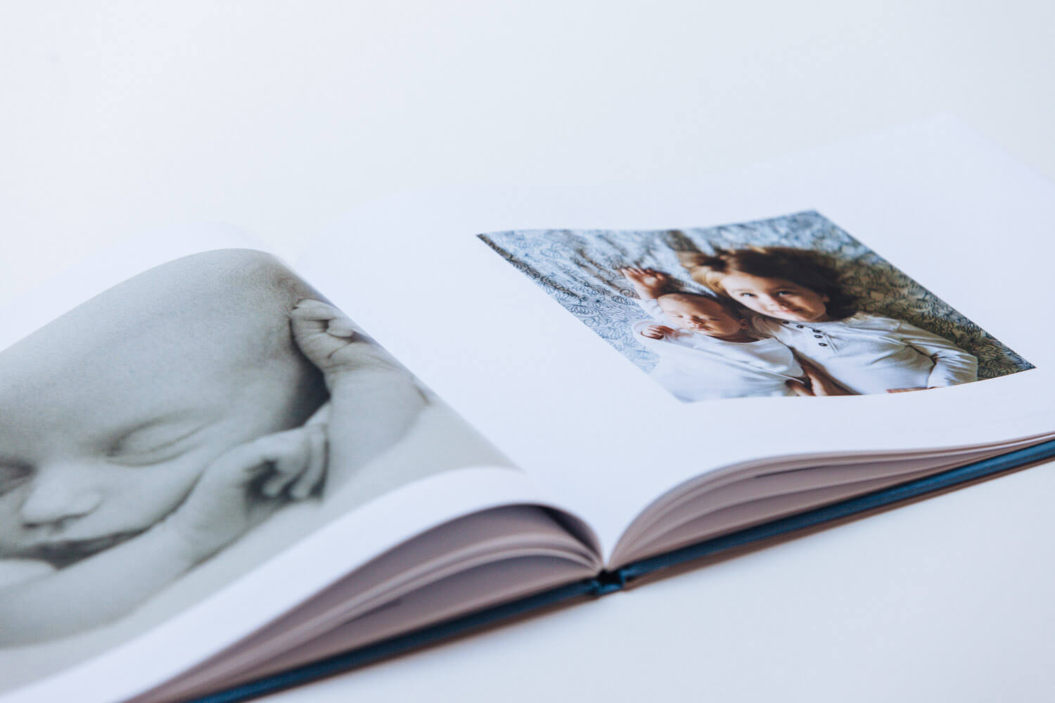
- Each picture goes on its own page (they may include a brief caption). Occasionally, and especially for longer books, we can combine images in a fixed grid of 2, 3, 4, or 6 images per page. In some of those cases, we may not be able to show captions with the photos, as there is obviously less room for them on the page.
You can see some pictures below with sample letters and pictures
 |  |  |
Please check out our gift book design and sample PDF for full details.